


White paint should be the easy part. That’s what I told myself before spending an entire Saturday repainting the same wall three times. Eider White looked perfect in the can.
Alabaster looked perfect on the swatch.
On the wall though? Completely different story. The undertones shifted, the lighting changed everything, and suddenly I had no idea which one I actually wanted.
If the eider white vs alabaster debate has you second-guessing yourself, you’re in the right place. What I found out might change how you look at both colors entirely.
Eider White vs Alabaster at a Glance (Quick Comparison)
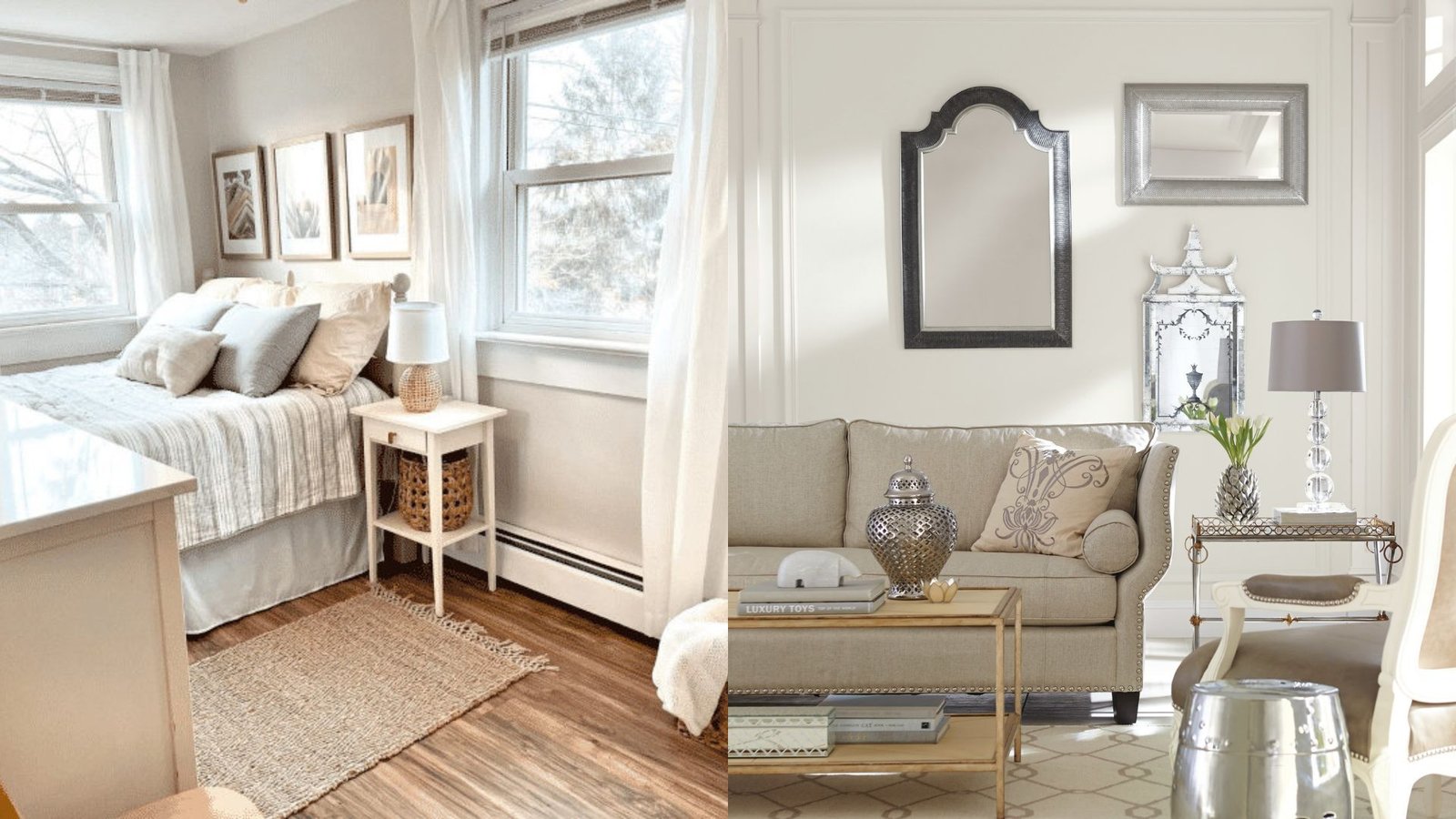
These two colors might both be called “white” but they behave very differently on the wall. Knowing where they differ saves you time, money, and a whole lot of second-guessing.
Eider White (SW 7014) is a soft white with subtle gray undertones. It reads clean and slightly cool. Alabaster (SW 7008) is a warm, creamy white with beige and yellow undertones. It feels inviting and soft.
The LRV difference matters here too. Alabaster sits at 82, making it one of the brighter options in the Sherwin-Williams lineup. Eider White comes in at 73, which is still light but noticeably less reflective.
For trim, both work well. But Alabaster tends to pair better with warm wood tones and cream-based decor. Eider White is the stronger pick alongside cool grays, crisp whites, and modern finishes.
What Is Eider White? (SW 7014)
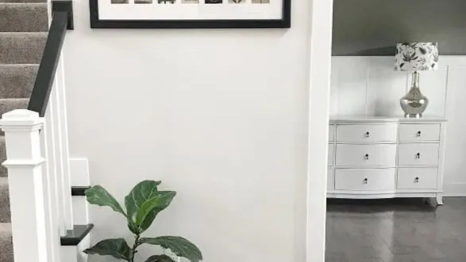
Eider White is a soft, understated white from Sherwin-Williams. It sits right at the edge between white and a very light gray, giving it a clean, calm presence on the wall.
Key Characteristics
Eider White doesn’t shout. It’s quiet and refined, which is exactly why so many people gravitate toward it for modern and minimal spaces.
Here’s what makes it stand out:
- Soft white base with visible gray undertones
- Can pull slightly cool or even faintly purple in north-facing rooms
- Looks crisp and clean in good natural light
- Pairs well with cool-toned furniture and fixtures
That subtle gray shift is what sets Eider White apart from warmer whites like Alabaster. In the right lighting, it looks polished. In the wrong lighting, it can read a touch cold.
LRV and Light Behavior
Eider White has an LRV of 73. That puts it in the mid-to-high brightness range.
In south-facing rooms with strong natural light, it looks fresh and almost bright white. In north-facing rooms, the gray undertone comes forward more noticeably.
If your room gets limited sunlight, pay close attention to this. Eider White can feel cooler and more muted than you expect in low-light spaces.
Where Eider White Works Best
Eider White is a natural fit for modern and minimalist interiors. It keeps things light without adding warmth where you don’t want it.
It works well in bedrooms, living rooms, and open-plan spaces with good light. It also pairs nicely with charcoal accents, cool grays, and matte black fixtures.
If your home leans contemporary or Scandinavian in style, Eider White is worth putting on your short list.
What Is Alabaster? (SW 7008)
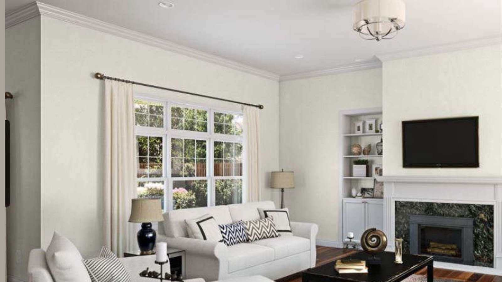
Alabaster is one of the best-selling paint colors Sherwin-Williams has ever made. And once you put it on a wall, it’s easy to see why.
Key Characteristics
Alabaster is a warm, creamy white that feels soft and welcoming. It’s not stark, not yellow, just gently warm.
Here’s what you need to know about it:
- Warm white base with subtle beige and cream undertones
- Can pick up a faint yellow in rooms with strong warm lighting
- Looks rich and cozy in natural light
- Works beautifully alongside warm wood tones and soft neutrals
The warmth in Alabaster is what makes it so popular. It takes the edge off a stark white without tipping into beige territory.
LRV and Light Behavior
Alabaster has an LRV of 82, which is quite high. It reflects a lot of light and keeps rooms feeling bright.
Even in rooms with less natural light, Alabaster holds its own. The warm undertone stops it from ever feeling cold or washed out.
This high LRV makes it a reliable pick for spaces where you need brightness without sacrificing warmth.
Where Alabaster Works Best
Alabaster is a classic choice for farmhouse, traditional, and cozy-style interiors. It adds warmth without being too heavy.
It works on walls, trim, and cabinets equally well. Many designers use it as a full-room color including ceiling and trim for a seamless, wrapped look.
It pairs especially well with warm floors, linen fabrics, brass hardware, and natural wood.
Eider White vs Alabaster: Key Differences
Both are beautiful whites, but the gap between them is real. Here’s a side-by-side look at the key differences.
| Feature | Eider White (SW 7014) | Alabaster (SW 7008) |
|---|---|---|
| Undertones | Gray, slightly cool | Beige, warm cream |
| LRV | 73 | 82 |
| Warmth | Cool to neutral | Warm |
| Feel | Crisp, modern | Soft, cozy |
| Best Style | Modern, minimalist | Farmhouse, traditional |
| Trim Use | Works with cool trim | Excellent on trim and cabinets |
| Lighting Sensitivity | Shows gray in low light | Stays warm in most lighting |
The core difference comes down to one thing: warm vs cool. That single factor changes how both colors feel in a room.
Which One Is Better for Your Home Style?

The right color depends on the vibe you’re going for. Let’s break it down by style so you can make a faster call.
Modern and Minimalist
Eider White is the stronger pick here. Its gray undertones fit right into clean, contemporary spaces.
It works well alongside cool-toned decor, sleek furniture, and minimal accessories. The subtle coolness adds a polished, intentional look.
In modern homes with lots of white, black, and gray, Eider White blends in seamlessly without looking out of place.
Farmhouse and Traditional
Alabaster was practically made for this style. The warmth and creaminess feel right at home in farmhouse and traditional interiors.
It pairs perfectly with shiplap, warm wood beams, linen throws, and vintage-inspired fixtures. It feels lived-in and welcoming from day one.
If your home has a classic, cozy energy, Alabaster will only add to it.
Transitional Homes
Transitional spaces blend old and new, which means either color can work depending on the balance you’re going for.
If your space leans more modern, go with Eider White. If it leans warmer and more classic, Alabaster is the safer bet.
When in doubt, test both on the actual wall. Transitional rooms are the most lighting-sensitive, so seeing them in person matters a lot.
Real-Life Tips Before Choosing
I’ve seen people pick the wrong paint color simply because they skipped a few basic steps. Here’s what actually helps before you commit.
These tips apply whether you’re choosing between eider white vs alabaster or any other two colors on your shortlist.
- Paint large swatches directly on the wall. Small chips lie. A 12×12 inch painted patch tells the truth.
- Check the color at different times of day. Morning light, afternoon sun, and evening lamps all show different sides of the same color.
- Hold your swatch next to your flooring and furniture. The paint doesn’t live in isolation. It lives next to your sofa, your floors, your curtains.
- Look at north-facing and south-facing walls separately. Light direction changes undertones significantly.
- Buy the sample pot first. It costs a few dollars and saves you from repainting an entire room.
Taking these steps seriously removes most of the guesswork. The color that looks right in all conditions is the one worth committing to.
Eider White vs Alabaster: Final Verdict
Both are excellent whites. But they’re built for different homes and different goals.
Choose Eider White if you want a subtle, cooler white that leans modern. It works best in well-lit spaces with a clean, contemporary feel. If you love gray tones and minimal styling, Eider White fits that vision well.
Choose Alabaster if you want a warm, welcoming white that works across most lighting conditions. It’s the more forgiving of the two and holds up beautifully in traditional, farmhouse, and transitional spaces.
If you’re still unsure after reading this, that’s your sign to grab both sample pots and test them side by side.
Conclusion
Here’s the thing nobody tells you: the right white doesn’t exist in a vacuum. It exists in your room, under your light, next to your furniture.
I’ve seen both eider white vs alabaster look completely different from one home to the next.
That’s why no blog, including this one, can make the final call for you. Only your walls can do that. So grab the sample pots, live with them for a few days, and trust your gut.
Already picked one? Drop your choice in the comments. I’d love to hear how it turned out!
Frequently Asked Questions
Is Eider White Warmer Than Alabaster?
No, Eider White is actually the cooler of the two. It has gray undertones, while Alabaster leans warm with beige and cream tones.
Does Alabaster Look Yellow?
Alabaster has a subtle creamy warmth but it doesn’t read as yellow in most lighting. In rooms with very warm artificial light, the yellow undertone can become slightly more noticeable.
Which Is Better for Kitchen Cabinets: Eider White or Alabaster?
Alabaster is the more popular choice for cabinets because its warm tone pairs well with most countertops and hardware. Eider White can work too, but it suits kitchens with a cooler, more modern feel.
Can Eider White Look Purple?
Yes, in north-facing rooms or under cool artificial lighting, the gray undertone in Eider White can shift slightly toward a faint purple or lavender. Testing it in your specific lighting before committing is important.
Is Alabaster Too Warm for Modern Homes?
It can feel off in very cool, minimal spaces. But in modern homes with warm wood accents or mixed materials, Alabaster balances well without overpowering the look.
