


Nobody tells you that choosing a white paint can send you into a full spiral. I found that out the hard way. I had two swatches on my wall for a week and still couldn’t decide.
Shoji White felt soft and grounded. Alabaster felt bright and clean. Both looked right. Both looked wrong. The more I stared, the more confused I got.
When comparing shoji white vs alabaster, the gap between them is subtle but it changes everything.
Stick with me here because what I learned about these two colors genuinely surprised me.
Understanding White Paint Colors (Why Undertones Matter)
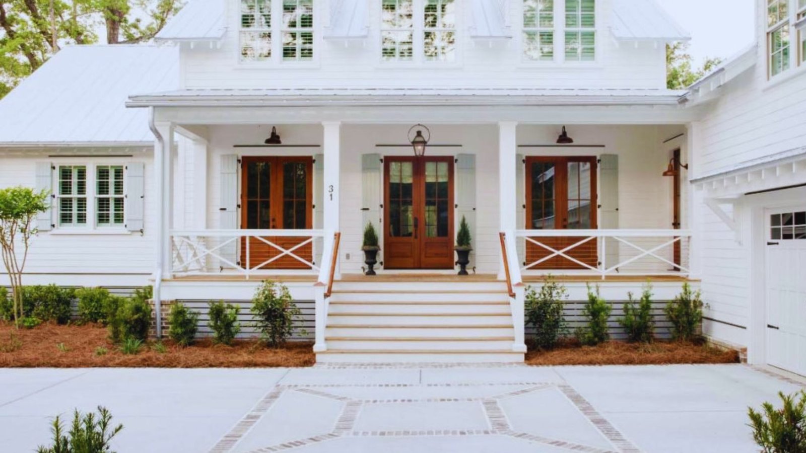
Most people assume white is just white. It’s not. Every white paint carries an undertone that shifts the whole feeling of a room.
Undertones are the hidden colors sitting beneath the surface. They can be warm like beige and yellow, or cool like gray and green.
You might not notice them on a chip, but on a full wall they become very visible.
Lighting makes this even more complicated. A color can look completely different in morning sunlight versus evening lamp light.
North-facing rooms pull out cool undertones. South-facing rooms bring out warmth.
This is exactly why shoji white vs alabaster comes up so often. Both are whites, both are warm, but they behave differently depending on where and how you use them.
What Is Shoji White? (Sherwin-Williams SW 7042)
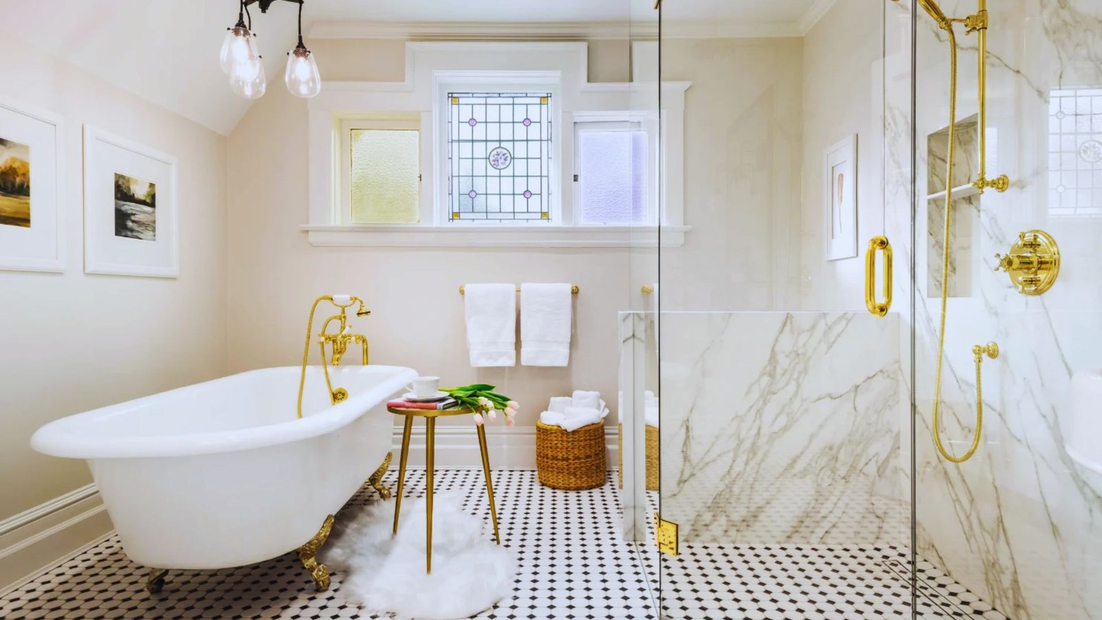
Shoji White is a soft, muted white from Sherwin-Williams with a slightly complex personality. It’s not a simple white and that’s exactly what makes it interesting.
Shoji White Undertones
Shoji White carries warm greige undertones, which means it blends beige and a touch of gray together. That combination gives it a grounded, earthy quality.
In certain lighting conditions, especially rooms with green-toned natural light, it can shift slightly green. This surprises a lot of people who weren’t expecting it.
Compared to traditional whites, Shoji White has more depth. It reads as a soft neutral rather than a clean, straightforward white.
Shoji White Brightness (LRV Explained)
Shoji White has an LRV of around 74. That puts it in the soft, muted range.
It’s not too bright and not too dull. It sits comfortably in the middle, which makes it flexible across different room types and light conditions.
In bright, well-lit spaces it looks like a warm white. In lower light it reads closer to a soft greige. Both outcomes are genuinely appealing.
Shoji White Suitability (Best Uses)
Shoji White handles large, open spaces particularly well. Its muted quality keeps big rooms from feeling overwhelming or too stark.
Here are the spaces where it really performs:
- Open floor plans where you need a cohesive, soft neutral
- Living rooms and hallways that see mixed lighting throughout the day
- Exterior walls where the greige warmth complements natural surroundings
- Any room paired with wood tones, warm metals, or earthy color palettes
It’s a color that works quietly in the background and lets everything else in the room take the lead. That’s a genuinely useful quality in a paint color.
What Is Alabaster? (Sherwin-Williams SW 7008)
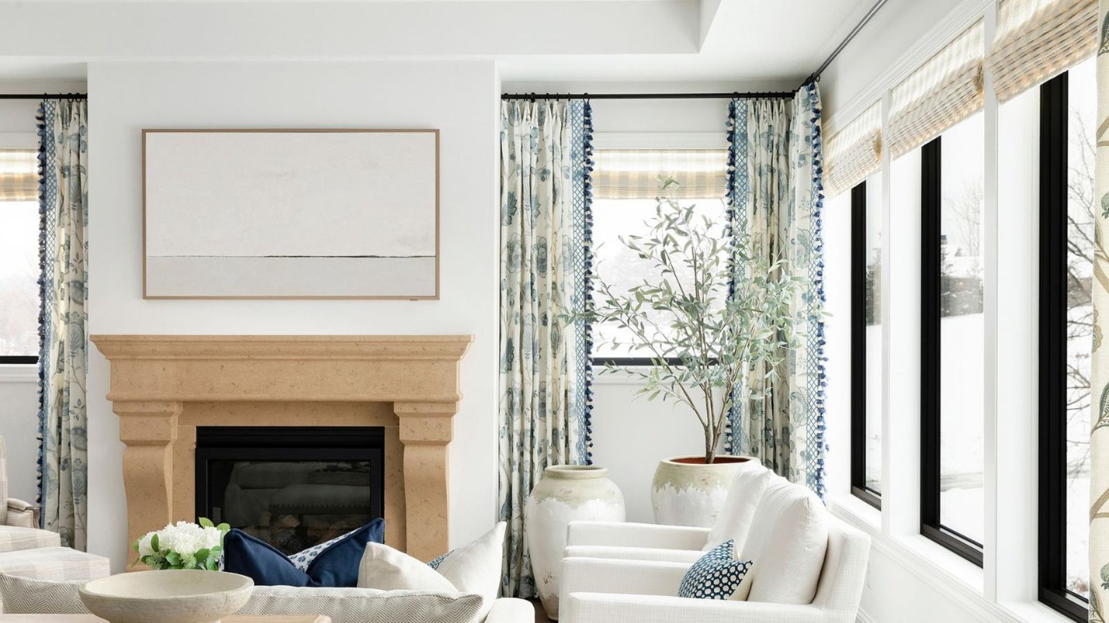
Alabaster is one of the most consistently popular whites Sherwin-Williams makes. There’s a reason designers keep coming back to it year after year.
Alabaster Undertones
Alabaster is a warm, creamy white. The undertones lean toward beige and a soft yellow base that reads as inviting rather than cold.
It’s cleaner and softer than stark whites, which means it doesn’t feel clinical or harsh on the wall. The warmth is present but not overpowering.
In most lighting conditions, Alabaster stays consistent. It doesn’t shift dramatically the way some whites do, which makes it a reliable and low-stress choice.
Alabaster Brightness (LRV Explained)
Alabaster has an LRV of around 82, which is notably higher than Shoji White. That means it reflects more light and keeps rooms feeling bright and open.
That extra brightness is one of the main reasons people reach for Alabaster in smaller or darker spaces. It does a good job of keeping things from feeling closed in.
The high LRV combined with warm undertones is a rare and useful combination. You get brightness without any of the coldness that often comes with it.
Alabaster Suitability (Best Uses)
Alabaster is one of the most versatile whites you can choose for interior spaces. It works across a wide range of rooms and styles.
Here’s where it really shines:
- Bedrooms and kitchens where warmth and brightness both matter
- Trim, cabinets, and ceilings where a clean but soft white is needed
- Cozy, traditional interiors that lean classic and comfortable
- Spaces paired with neutral palettes, pastels, or soft natural tones
If you’re painting trim and walls the same color for a seamless look, Alabaster handles that beautifully. It’s one of the few whites that works equally well on every surface.
Shoji White vs Alabaster: Key Differences
Both colors are warm and both are widely loved. But side by side, the differences are clear enough to matter.
| Feature | Shoji White | Alabaster |
|---|---|---|
| Undertone | Greige (gray and beige) | Creamy warm |
| Brightness (LRV) | 74 (muted) | 82 (bright) |
| Feel | Soft, earthy | Light, airy |
| Best For | Large spaces, exteriors | Interiors, cabinets |
| Lighting Impact | Can shift slightly green | Stays consistent |
| Style Fit | Modern, organic, transitional | Traditional, farmhouse, classic |
In the debate of shoji white vs alabaster, the choice often comes down to warmth versus brightness.
Shoji White gives you a grounded, earthy tone. Alabaster gives you a cleaner, more luminous warmth.
Real-Life Tips for Choosing Between Shoji White and Alabaster
I’ve watched people agonize over this decision for days when the answer was on their wall the whole time. A few practical steps make this a lot easier.
These tips apply directly to the shoji white vs alabaster decision, but they’ll help with any two paint colors you’re comparing.
- Paint a large swatch on the actual wall. A 12×12 inch patch is the minimum. Anything smaller will mislead you.
- Check it at three different times of day. Morning, afternoon, and evening light will each show you a different side of the color.
- Hold your swatch next to your flooring, furniture, and fixtures. The paint shares a room with everything else you own. Make sure they get along.
- Pay attention to which direction your windows face. North-facing rooms cool down Shoji White noticeably. South-facing rooms make Alabaster glow.
- Don’t skip the sample pot. It costs very little and saves you from a full repaint you didn’t want.
The right color is the one that looks good in your space at every hour of the day. That’s a standard you can only test in person, not on a screen.
Conclusion
Nobody warns you how personal a paint decision really is. I’ve seen shoji white vs alabaster play out completely differently in two identical rooms just because the furniture was different.
That’s the part no guide can predict for you.
What I can tell you is this: don’t commit until you’ve lived with both samples for at least two days. Your gut will tell you which one belongs.
Already made your pick or still stuck between the two? Drop your question in the comments. I read every single one and I’m happy to help you land on the right call.
Frequently Asked Questions
Is Shoji White Warmer Than Alabaster?
No, Alabaster is actually the warmer of the two. Shoji White leans greige, which gives it a cooler, more neutral quality compared to Alabaster’s creamy warmth.
Which Is Brighter: Shoji White or Alabaster?
Alabaster is brighter with an LRV of around 82 compared to Shoji White’s 74. That higher LRV means Alabaster reflects more light and keeps rooms feeling more open.
Does Shoji White Look Gray?
It can in certain lighting, particularly in north-facing rooms or under cool artificial light. The greige undertone can shift toward a soft gray or even a faint green depending on the conditions.
Is Alabaster Too Yellow?
Not typically. Alabaster reads as a soft, creamy white rather than a yellow one. The warm undertone is there, but it’s subtle enough to work in most spaces without feeling off.
Can I Use Shoji White and Alabaster Together?
Yes, but carefully. The contrast between them is subtle, so they work best in clearly defined zones like walls in one color and trim in the other, rather than side by side in the same area.
